I had some time between jobs today so I thought it's about time I put together a tutorial. The main area I want to focus on is the initial 5 or 6 steps. I called the car 'Prometheus', (big fan of the Alien movies) and back story about the Greek God is pretty cool. Anyways, it's a futuristic design with hubless maglev wheels and maybe designed for 2050 or something.
There's multiple Photoshop tutorials on the subject, so to offer something new I figured I'd show how I set up the line art using Adobe Illustrator and transferring it to Photoshop to render. Like any program Illustrator can take some practice, but I've found it incredibly useful for my field of work. Especially more technical drawings like setting up 4 view shots for creating CAD models of your vehicles. So hope you enjoy.
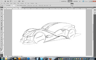 |
| 1) As with any render, start with a good sketch. This one's still pretty
loose, but has enough to build on. I've been working with a Cintiq
12WX, so still getting the hang of it, but definitely worth it if you
can swing it. Doesn't matter how you do the sketch, ballpoint, Wacom, whatever works. This will be your canvas to trace over, so save or scan it and place it in Adobe Illustrator. |
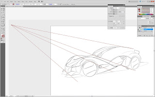 |
| 2) Once in Illustrator, It's worthwhile to set up a few perspective lines. This program is great for it. Vector graphics allow you to set up good foundations for your drawings. Photoshop can of course do this fine as well, but vectors won't pixilate and you can continuously move them into position until you're satisfied. This process revealed a few perspective fixes I needed to make as well. |
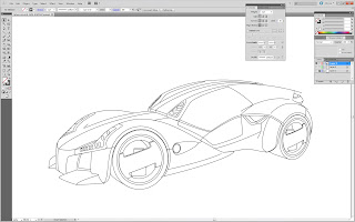 |
| 3) Using all paths, I fixed the perspective and simply traced the sketch, detailing out other areas like the lights and wheels. Again, the beauty with vectors is you can continuously tweak your paths/lines until your satisfied. Thickness of your line is also a big factor. With thicker lines, it can look more Hotwheels or comic like (which is perfectly fine), with thinner almost suggestive lines you can achieve a more realistic look. This render errs on the Hotwheels aesthetic. You'll notice at this stage the drawing will loose that free-form aesthetic of the hand drawn sketch. That's where this next step makes this all worthwhile... |
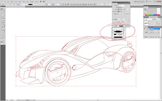 |
| 4) In the 'Stroke' tab at the bottom is a box called 'profile' where you can set up the stroke characteristics. Select the lines and choose a line profile. I use a couple of these to get that more freehand sketch look, but I'm also wanting to keep a real clean appearance. I'm using CS5, I believe anything previous won't have this profile option. But in the older versions you can actually create custom brushes (pen strokes) that work in a similar manor. You can set up different line widths and tapers. |
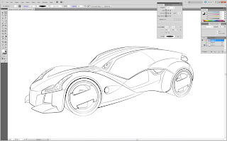 |
| 5) You can see the sketch has a nice almost perfect hand drawn appearance. I believe this method works well for cars as these are typically clean, smooth, or chiseled forms. Again, you'll see how easy it is to adjust your lines (including making them more suggestive or faint). If you were to do this free hand or with Photoshop, adjusting these lines would mean spending extra time erasing an area and redrawing. With Illustrator you can just grab a path and move the line until it's just right without erasing or redrawing it. Next is to save this out and open with Photoshop. Depending on the detail you want, from sketches to get to this stage took about 30-35 minutes. You can knock it out pretty quick though if you're keeping linework to a minimum. |
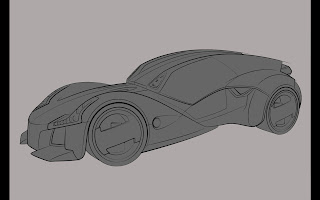 |
| 6) For the next few stages there's tons of tutorials out there so you'll likely see some similar steps in here. A grey background helps in the process to push your highlights out. The beauty of the lines we created in Illustrator is they're all closed, so I simply take the magic wand tool and select the negative space, then select inverse and fill in the car with a mid tone grey. |
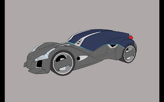 |
| 7) It's not necessary, but my preference is to block out the different materials early on. I'm not so much concerned about colors yet and I'll leave the body (paint) grey for now. This helps to get a feel for what the design is going to look like. Helps to see any glaring issues and I can always go back and tweak in Illustrator and re-import the line work. Knocking out the forms with values is done much easier in grey-tone. Apart from a few areas, color can
make things complicated so we'll be adding that later on. |
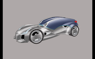 |
| 8) Onto the highlights. Pick your light source, this is sort of centered above and off to the rear. With the magic wand you can use that sketch layer to section off areas of the highlights and create the sharp edges at the ends of the forms etc... With a 20 - 30% white airbrush use broad strokes as much as possible. In a few spots you can see it gets a bit mottled because I was using too small a brush. |
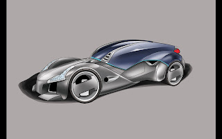 |
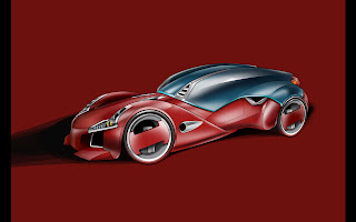
| 9) Here we've got much of the shading in as well. This layer is set to multiply and it's just a mid to dark grey. Placing the ground shadow also helps a lot in visually planting the car. You can see that I've adjusted some of the highlights too. As you add the shading I find that I need to adjust highlights to get the right balance. One of the layer styles I often use for the tires is 'Bevel and Emboss'. Because the tires are perfectly round from using Illustrator lines, the bevel highlights come out nice and crisp to create that tire profile. You can adjust the light source and depth etc... After, I rasterize the layer and make a few small tweaks to finish the tires off. |
 |
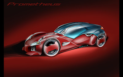
| 10) About 95% complete at this stage. I've further refined the highlights and shadows and added a red layer to the body and matched the background to that. Has a nice dramatic affect. I re-examined the composition and moved the car a touch to the right as well. |
 |
| 11)
Lastly I add another layer of highlights to pick out some of the
brighter spots. You can see I've selected an area of the glass to show a glow inside the car. The idea behind the glazing is it's a thick layer that even wraps around the rear fenders. I've also added some details like the grille mesh and
glow around the lighting areas. I'm happy with the design, but I think
I've still got to get the hang of using the Cintiq. I'm thinking it's
maybe a bit busy with the highlights, but you can at least see how the
clean lines work. Thanks... |
|
 |
| Here's other examples to show similar results. This is my sushi taillight supercar and below is a convertible version of the Kestrel. These probably took 2/3 the time of Prometheus. Simpler linework and you can see how clean it can look. |


Hi Darren< My name is Tim and I was wondering if you could help or give me some tips on how to perfect my design that I am currently working on. I have drawn out a couple blueprints in Illustrator of a concept vehicle and it just doesn't look right, I am having trouble rendering it to give it more life. Can you contact me if you don't mind?
ReplyDeleteEmail:artistixdds@gmail.com
thanks